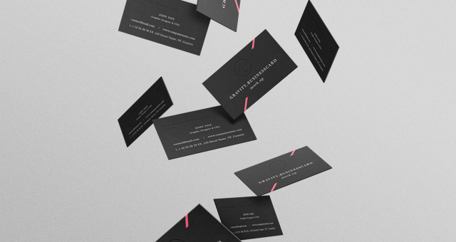
The best business cards convey far more than just the printed letters and numbersA�inside the 3.5 x 2-inch borders. Your card represents you and your brand, and ita��s literally what your customers carry away from a meeting or sales call with you. Shouldna��t it say enough to make you stand out from your competition?
Experimenting withA�business cardsA�until you get the results you want can be expensive, time-consuming and counterproductive. Ita��s worth the time it takes to carefully consider the different elements of what makes a great business card and get it right the first time. A�You mayA�consider engaging a graphic designer to craft the look of your business card.
Whether you hire someone or design it yourself, here are five characteristics of a business card that will make people remember you and your brand.
1. Simplicity
- People sometimes clutter up their cards with extraneous material in the mistaken belief that ita��s original and memorable. Too much visual noise will bury your contact information along with the message you want to communicate. AA�clean designA�that makes effective use of negative space is more eye-catching and professional.
- You cana��t go wrong with classic black and white, but a splash of color will get your card noticed. Avoid garish or clashing hues and stick with colors that are consistent with your brand.
2. Essential Information
- This may seem obvious, but if youa��re not careful ita��s easy to list too much or not enough. Include your name, job title and contact information along with your website if applicable. If youa��re active in social media such as LinkedIn or Facebook, add that contact information.
- Some experts recommend using quick response (QR) codes for contact information, as a way to save space and encourage interaction, but you should do it only if your target audience is tech-savvy. Otherwise, you run the risk of distancing yourself.
3. Readability
- Cramming too much text into the card forces you to use a smaller font, which might look good on a monitor but turns out to be unreadable. Use at least an 8-point font for legibility, along with a color that is readable against the background color.
- Choose a typeface like Courier thata��s legible but not too commonplace and use no more than two different styles. Resist the temptation to use calligraphy or a novelty typeface unless ita��s appropriate for your business. If you do, ita��s best used sparingly as an accent to highlight certain pieces of information.
4.A�Unique Selling Proposition
- Customers may remember you, but will they remember why they should buy from you? Your company may already have a unique slogan or tagline you can include on your card. If not, consider the more memorable slogans of some of the top national brands, such as Disneylanda��s a�?The Happiest Place on Earth,a�? and use them as a guide.
- An alternative is a simple, straightforward but compelling phrase that will give customers a reason to buy. For example, a business card for an automotive repair shop may state, a�?All repairs guaranteed. All the time.a�?
5. Quality Card Stock and Printing
- Has anyone ever handed you a business card that had an impressive design but was printed on inexpensive, flimsy paper? Substandard materials will counteract the positive effects of a professional design, implying that you and your company have equally low quality standards for your product or service.
- Die-cutting, rounded corners or other special effects can set your card apart, but tread lightly. Overuse of bling can backfire and come off as cheap and tacky. Choose features not simply for their own sake, but because they complement and enhance your brand.
- Are you considering a non-standard size? It will certainly make your card stand out, but balance it with the idea that the card wona��t fit into wallets or business card holders. Choose the option with the most relevance to your brand and message.

